


087. Color and Intent - Part II
The visual DNA of Apple TV+'s latest series 'Severance.'

Hi, I’m Maggie, and welcome to Tender Forms Off-Camera: a bi-weekly newsletter on all things slow: beauty, fashion, living. Links in this newsletter may include affiliate links or discount referrals. If you enjoy and would like to support this newsletter, click the button below or shop through my links! No pressure but thank you if you do.

When Apple TV+ was first released, I watched just about every series within the first few months. In my newsletter idea and brainstorm folder, I’ve written notes about each one and how I was disappointed by them all. However, as suspected, Apple TV+ is finally gaining its footing, and within the past few months, they’ve released at least two incredible series. One such series is ‘Severance.’
Severance is a sci-fi thriller created by Dan Erickson about a looming psychological terror that descends upon a workplace and its employees.
If I were to elevator pitch this show, it would be:
Think Michel Gondry’s surrealism meets Noah Baumbach’s characters meets Paul Thomas Anderson’s themes with an amuse-bouche of Wes Anderson’s symmetry.
I was blown away from the beginning. After the series premiere, I had a rush of thoughts and emotions. I immediately wanted to know what happens next, but I also wanted to sit and savor everything I’d just seen. Luckily, we started right when the series premiered and were forced to wait for each weekly episode (which was undoubtedly the way to watch this).
Severance: Season 1 ★★★★½
While I’ll be diving into the visual DNA of the series and what makes it spectacular, no big spoilers will abound. However, in doing so, I’m essentially teaching you to spot clues along the way, and I do have to disclose specific facts for it all to make sense. If you’d rather not know, I’d suggest watching the series first and then revisiting this post.
As with all well-executed sci-fi, the key to its success is in its worldbuilding. But how can you possibly teach the endless complexities of such a world without banging it over the head of its viewer or taking several hours? You build it into the world itself. The series bakes its lifeforce, rules, and secrets directly into its color palette: the humble RGB (red, green, blue).
At first, it’s easy to mistake the color palette as simply the “minimalist style” of the series and its sets. But this is the flair of a series where every decision has intent, and nothing is coincidence. Here’s a very top-level breakdown when it comes to defining the color palette (we’ll get into more detail below):
Blue: Good, Orderly, (for the better of the) Group
Red: Bad, Outlier, (for the better of the) Individual
Green: Environment (middle ground), Duality, Transformative
And here is a quick series glossary:
Lumon: The company
Macrodata Refinement (MDR): The department our leading man works in
Optics and Design (O&D): Another department within Lumon
Severed: A reference to Lumon employees and the surgical procedure they underwent to work there: severing their brains so there’s a hard split between their work-self and personal-self. One does not know a thing about the other; no memories, no facts (unless sanctioned by the company). Every workday, the employee rides down an elevator where the switch in their brain occurs.
Innie: Work-self (office hours)
Outie: Personal-self (out of office hours)
Mirrored Symmetry

There’s a beautiful symmetry to this series, whether in its shots, sets, or plot, and the reasoning is two-fold:
Symmetry is calming. There’s generally less information to intake. If you’ve seen one side, you know what’s on the other, and there’s often an emotional response of serenity.
Symmetry is a veil. It can hide something by appearing to be orderly; however, a small detail usually gives it away. In the above left still, it’s the headlights of a vehicle on one side of a Lumon facility “loop.” The right still showcases the character’s split through a mere fishtank split in half. Both sides have overhead lights illuminating the fish, but you’ll notice one that’s blue and one that’s red (yes, perhaps a nod to ‘The Matrix’ red pill blue pill).
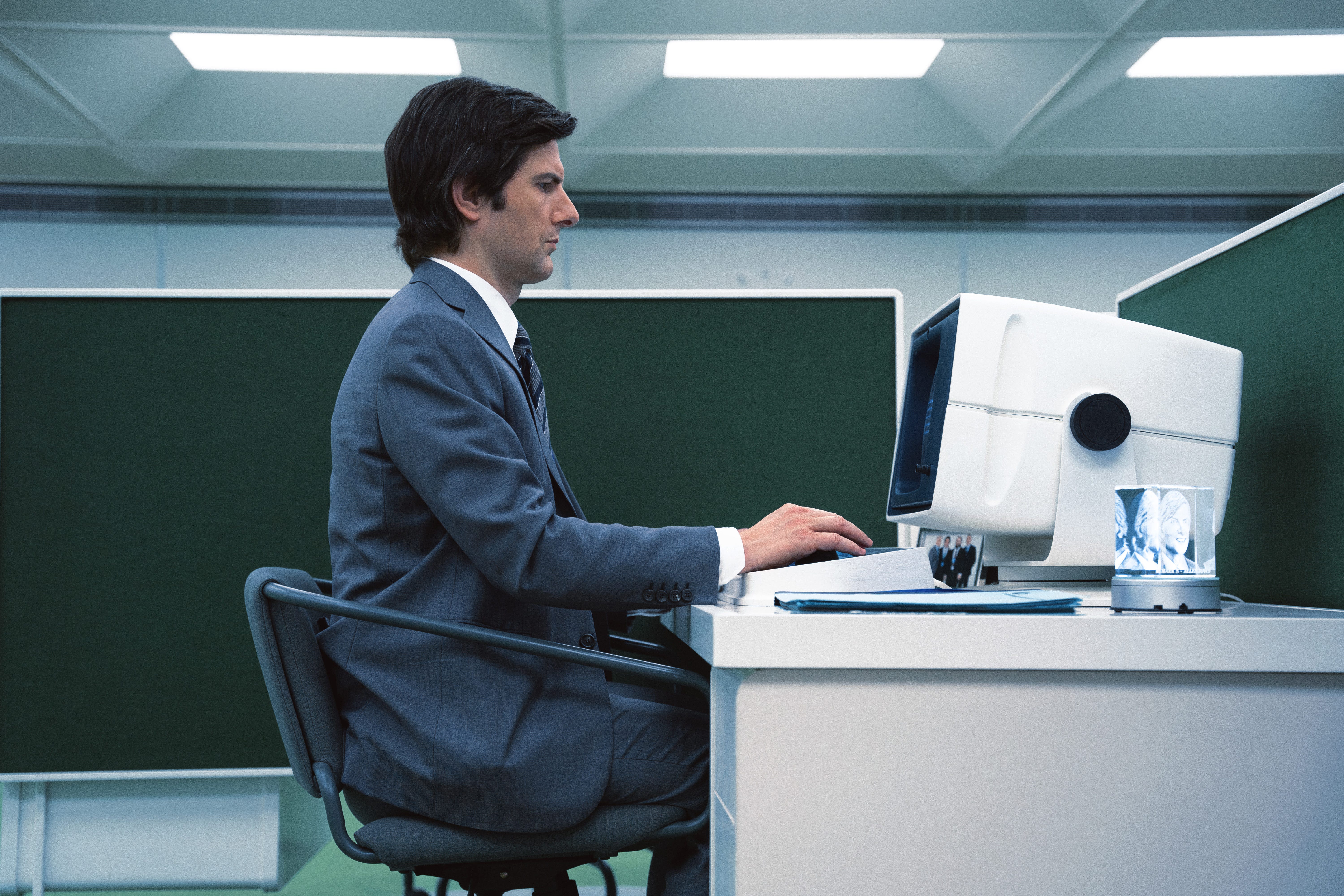
From the getgo, we associate the color blue with anything and everything company-related. When we first meet Mark (Adam Scott, our leading man), he’s sobbing alone in his car, cast in cold blue lighting, lonely and hurt in his corporate slate blue suit. When he heads into work and changes his ID card, it’s the first time we’re introduced to the bright cheery Lumon brand blue. As you work your way through the series, you’ll notice almost all things Lumon branded are blue: whether it’s the “rewards” for hard work, the coffee mugs, conference room chairs, or office attire. Mark’s boss Harmony Cobel always wears a stern deep blue suit, Mark’s suits are blue, and even the Optics and Design department’s lab coats are blue. In short, the office executives and employees who are clear rule-followers always wear blue. Which makes it all the more interesting when you spot a character’s wardrobe shifting from blue into another hue.
Above and Below
The camera is a wonderful character in itself. Like the series symmetry, it often mirrors the plot in interesting ways if you can spot it. At Lumon, it’s always about what’s above and below: above where the employees’ Outie lives and below where their Innie resides.
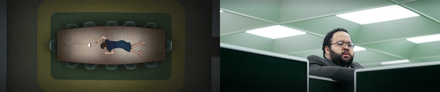
One thing to notice in both of the above stills is the use of green. At Lumon, green pervades the workplace as the most common color found in noteworthy settings: the Macrodata Refinement office (above right still), a closed hallway leading to the Break Room, the onboarding room (above left still), and the Wellness Room. It best represents a transformative space where there’s a “crossing” element for the character: from serene to painful, from fear to love.
Barriers and Crossroads
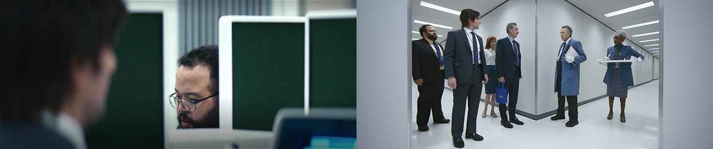
Nothing spells secret as an excellent old-fashioned barrier, and Severance is filled with them. One of the most enjoyable sequences in the series premiere was its introduction of Lumon’s hallways. There’s an extra-long take of Mark walking through its narrow and sharp-cornered corridors. And with all of them seemingly the same, it’s easy to lose your way. The hallway maze is built to keep employees and departments separate, which is why it’s so alarming when two departments (MDR and O&D) literally come head to head at a crossroads in a later episode, a noticeable shift in the series.
The obstructed views continue in Mark’s MDR department. The room itself is spacious apart from a small cluster of four desks configured just so for optimum work efficiency. When the cubicle walls are up, your co-workers are hidden from you. Only the viewers catch a glimpse of more than one as the camera weaves around.
A subsect of the “obstructed view” is in the series’s lighting, specifically its sharp but limited illumination. I believe it’s first seen at the Lumon facility’s top levels as a sunray gliding along the facade of Egan’s (Lumon founder) stone profile. Next, in the stairwell as Helly R.’s Outie tries to piece together why she’s in there. Then, in Mark’s basement, the camera lingers on the stairs illuminated by light flooding from the above floor. These dubious slivers of light are also seen in the main title sequence—all signifying glimpses and shadowed secrets of the larger story.
Opposing Opposites
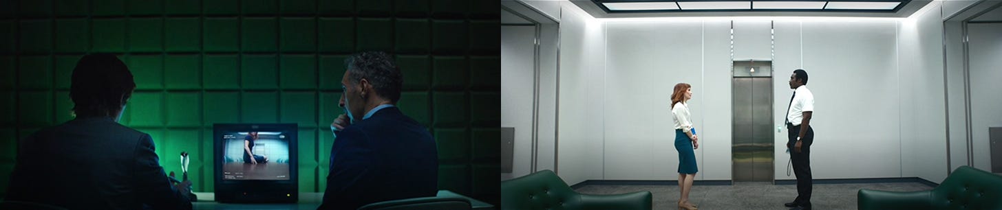
Another form of barrier is separation within the same space. A split is infused into every aspect of this series, most noticeably in the people but not as you would think. Characters are often found standing or sitting on opposing sides quite literally, whether between rooms, glass, waiting at the elevator, behind or in front of a desk, the list goes on.
Outliers
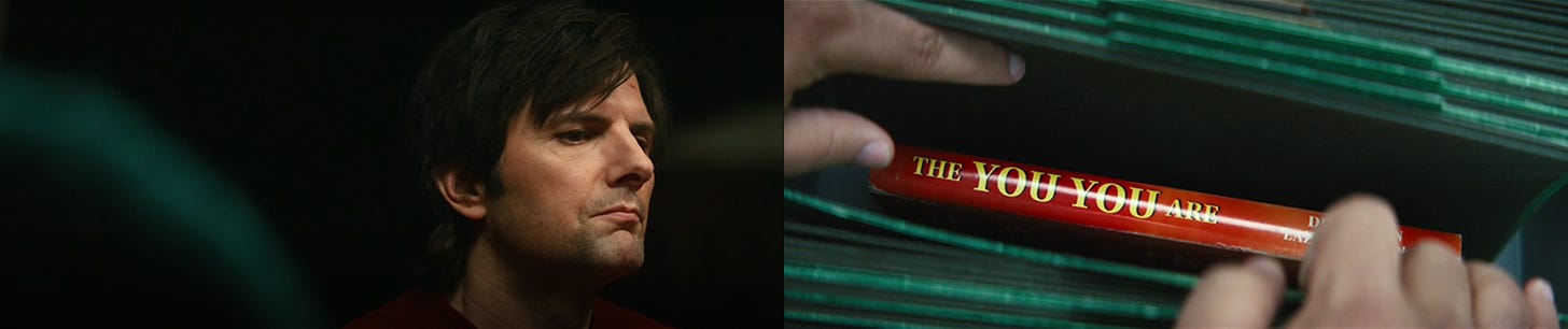
And last but not least, we’ve come to perhaps the most overwhelming theme of the “outlier.” No color better describes this than red. In the first episode, we hardly notice it apart from the fish in Mark’s home, Helly R.’s hair, and when Mark dons a deep red sweater as he begrudgingly attends his sister’s “dinner” party. But red is always a difficult color to miss. It stands out, and soon we discover that anyone or thing that is red is an outsider, contraband, someone, or something that doesn’t belong.
Even when Mark is at home or at his sister’s, he doesn’t belong there. Helly R., as we find, certainly doesn’t want to belong at Lumon, and it’s interesting that all women in the Lumon facility dress in red at one point or another. In a scene where MDR visits the company museum wing, there is only one female CEO wearing a head-to-toe red suit. Against company policy, Mark’s brother-in-law’s book is a bright red splash in a sea of blue and green. No outside literature is supposed to be at Lumon, but as Mark begins reading the cleverly named “The You You Are” (representative of the Innie and Outie), he is unaware that his brother-in-law is the author. The words are so impactful to him that they are almost like scripture, further echoed through red-edged printing reminiscent of bibles.
Main Title Sequence
An honorable mention has to be given to the delightful, surrealist, nightmarish main titles. Most (good) main title sequences sneak in plenty of easter eggs, and this one’s no different if you look closely. Happy hunting.
Main Title Credits:
Network: Apple TV+ Client: Red Hour Productions, Endeavor Content
Director: Ben Stiller
Title Art Direction and Concept: Oliver Latta
Production Studio: extraweg
3D: Oliver Latta
Music and Score: Theodore Shapiro
Typography: Teddy Blanks
Post: Nick Waetjen (Post Mango)
Producers: Ivan Flugelman (extraweg), Gerry Robert Byrne, and Katie Pruitt ( Red Hour Films)
If you’re looking for a new series to watch or curious to give Apple TV+ a chance, I recommend starting with its best (thus far). So impeccably cast, everyone is a favorite at one point or another.
Top Cast:
Adam Scott
Zach Cheery
Britt Lower
Tramell Tillman
Jen Tullock
Dichen Lachman
John Turturro
Patricia Arquette
Christopher Walken
Series Credits:
Directed by Ben Stiller and Aoife McArdle
Written by Mohamad ed Masri, Dan Erickson, Wei-Ning Yu, Anna Ouyang Moench, Andrew Colville, Kari Drake, Helen Leigh, and Amanda Overton
Cinematography by Jessica Lee Gagné and Matt Mitchell
Original Series Soundtrack by Theodore Shapiro
Editing by Geoffrey Richman, Gershon Hinkson, and Erica Freed Mark
Casting by Rachel Tenner
Production Design by Jeremy Hindle
Art Direction by Angelica Borrero
Set Decoration by Andrew Baseman
Costume Design by Sarah Edwards
Thanks so much for reading! I’m so glad I finally got this one out there. It’s been ruminating in my head for weeks. Have you watched ‘Severance,’ and if so, what did you think? I’d love to know! You can always leave a comment or reply to this email to chat privately.
As always, I hope you have a great start to your week. See you next week!
